


KEY & COLOR
Family Portraits Preparation Guide Essentials begins by helping you make your clothing selections The very first task at hand is to establish your KEY. The KEY simply refers to the mood or style of your portrait. It also refers to the lightness or darkness of the clothing colors in relationship to the background. When clothing and background correspond we say they are IN KEY. With clothing and background IN KEY, faces become the most dominant element and thereby offer an opportunity to achieve greater emotional impact.
There are three basic KEYS: high, medium and low.
- High Key: light colors and pastels.
- Medium Key: neither dark or light colors, but values in between, such as denim and khaki.
- Low Key: dark, deep color tones.
Generally speaking, we try to avoid mixing our Keys. For example, we want to stay away from wearing black with white shirts. Since the human eye is always drawn to the greatest zone of contrast, the area where mixed keys intersect is where the portrait will have the greatest draw. Most often, mixed keys result in the most dominant element being the waistline. Not exactly the makings for a beautiful portrait.
Having said that, there are exceptions. If keys must be mixed it is imperative to keep them within one step of each other. That is, High and Mid Keys can be cautiously mixed, as well as Low and Mid Keys. Rarely is it appropriate, however, to mix Low and High – the contrast is too great.
To discover your KEY, our Family Portrait Preparation Guide Essentials suggests you read the descriptive phrases below and make note of which Key best expresses the style of portrait you have in mind. As you do so, please keep in mind people invariably look and photograph best in Mid to Low Keys.
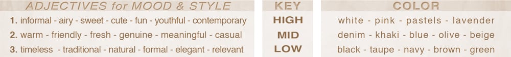
Lastly, be mindful of two challenging colors: RED and WHITE. Because red is the most dominant color in the spectrum, it tends to be the most intense element in any portrait. Whereas red may work in individual portraits, it’s difficult to blend in family/group portraits. White, although appropriate for children and lighter backgrounds, is not a forgiving color. It tends to add 10-20 pounds and its stark contrast is not flattering to most skin tones. Lastly, please be aware that the lighting for “High Key” tends not to be as three-dimensional as the other keys.
SIDE NOTE:
At the risk of straying far afield, this would not be much of a Family Portraits Preparation Guide Essentials were I to fail to mention one of the primary objectives of family portrait design – creating three dimensions.
Every portrait, whether created by professional or amateur, is inherently equipped with width and height. Thus, we hear such common terms as 8×10, 30×40, etc., when specifying portrait sizes. We refer to sizes as “dimensions,” which is sort of a misnomer in that width and height address only two aspects, conspicuously omitting the third dimension, depth.
Portraits do not naturally come with depth – it has to be created. Depth is what the professional photographer brings to the equation. It’s what differentiates the snapshot from a portrait of emotional impact. Without depth, it’s simply a flat, two dimensional, cardboard cutout. With it, the image connects to the viewer, elevating it to heights approaching art.
The two integral components of depth are light and shadow. A professional photographer is adept at of using tones, shadows, and highlights to create an illusion of three dimensions.
As this relates to Key & Color, the darker the key, the greater opportunity of playing with light and shade to create a three-dimensional portrayal. Lighter, High Key tones, however, lessen the prospect of light and shadow and thus tend to be not as dimensional as Low Key portraits.
To wit, I prefer to work with darker toned, Low Key colors.
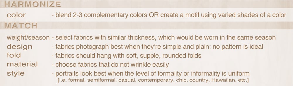
STYLE & FABRIC
-
- Fabric Design that is simple and plain tends to photograph best. They are not distracting and will not draw attention away from the face. Patterns may be selected just as long as the design is muted and unobtrusive. Remember, simplicity is the key.
- Observe the fabric fold. It should have supple, rounded edges. Does it form sharp creases or is it resilient with pliable curves? As you might have guessed, just as in our relationships, we prefer fabric with flexible, soft edges…
- Fabric material should be soft and not easily wrinkled. To determine whether or not a piece of clothing will work, do the Rumple Test: take the fabric in your hand and crinkle it into a ball. If it bounces back without creasing, the fabric will do just fine. Best test yet, sleep in it!
- Clothing should have a loose fit. The tighter the clothing, the heavier the look and the more challenging it can be to appear and be comfortable.
- The weight & season of the fabric must also be planned. Heavy materials denote cool weather, while light fabrics imply a feeling of warmer climes. Some materials appear to be worn in winter while others seem to be most appropriate for Spring. More on this in “Harmony vs Matching.”
HARMONY VS MATCHING
There is a vast misconception when it comes to making clothing selections for portraits. The confusion arises out of our desire to acquire the perfect portrait. First of all, let me dispel this notion: there is no such animal as the perfect portrait. There are, however, portraits of excellence. Before we move into this arena, however, we must first unravel the puzzle of Harmony vs Matching. The reality of it is actually not that difficult.
Simply put, in making our clothing selections our task is to discern which aspects of harmonizing and matching requires which approach.
In a nutshell, our Family Portraits Preparation Guide Essentials recommends a twofold, practical approach in coordinating one’s portrait clothing:
-
-
- harmonize colors
- match fabric
-
THE COMPLETE Family Portraits Preparation Guide
INTRODUCTION
ESSENTIALS
FOUNDATION UP
DO AND AVOID
As always, should you have questions regarding any aspect of our Family Portraits Preparation Guide Essentials, no concern is too small.

Mark Jordan
Master Craftsman Photographer
American Society of Photographers
International Photography Hall of Fame & Museum
Orange County Photographer of the Year
3-Time Honoree -EPCOT’S World’s Greatest Photographers Exhibit
When looking for a professional Orange County Family Portraits photographer, or Orange County Headshots Photographer please call 949-713-4050 or complete our online request form.
[…] Essentials […]